
Lead Designer (UX & UI)
Mobile App Experience
Figma, FigJam
2 Months
When I first joined this project, the ambition was clear: build an AI-powered basketball app that doesn’t just track your game but transforms it into a global experience. Basketball culture thrives on competition, visibility, and connection. Our goal was to capture that essence by enabling players to:
Track their stats automatically through AI-powered recognition.
Get personalized highlights from their everyday runs.
Climb global leaderboards and measure themselves against peers.
Earn rewards that tie back into the basketball lifestyle.
The product vision wasn’t simply another performance tracker. It was about creating an ecosystem of gamified basketball culture that mirrors what TikTok did for self-expression and what Strava did for running.
We identified three primary personas through conceptual research and competitor benchmarking:
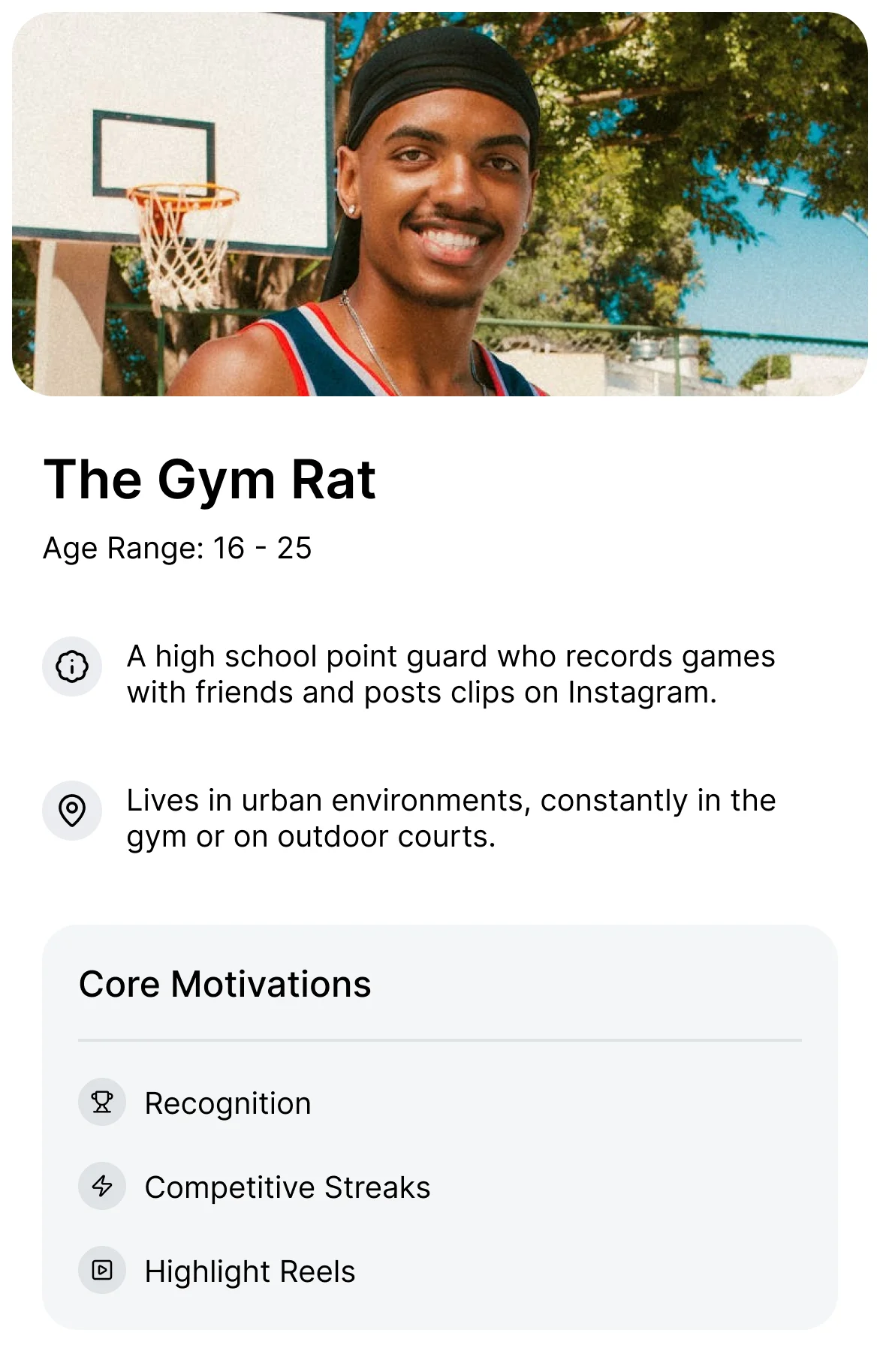
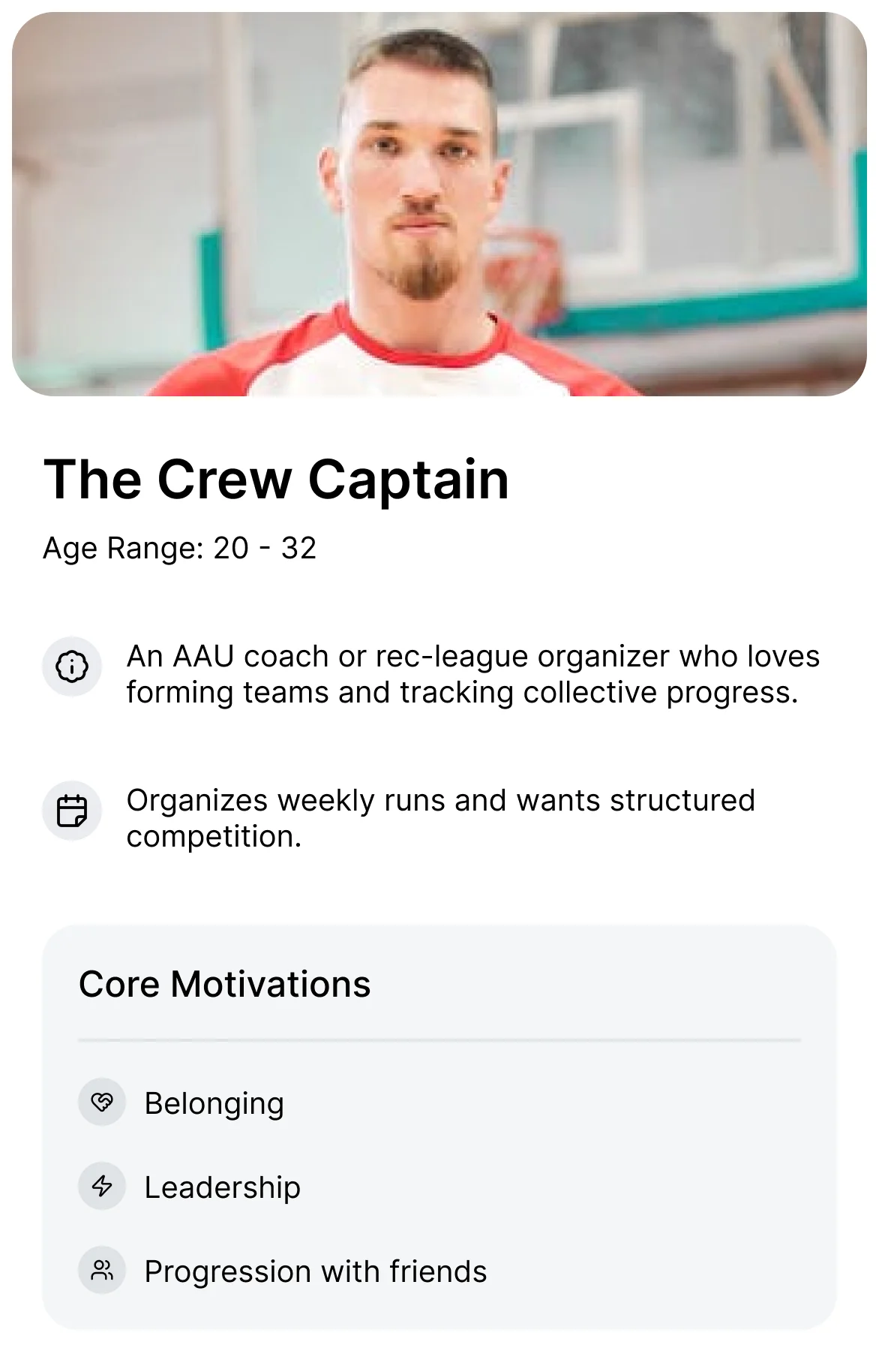
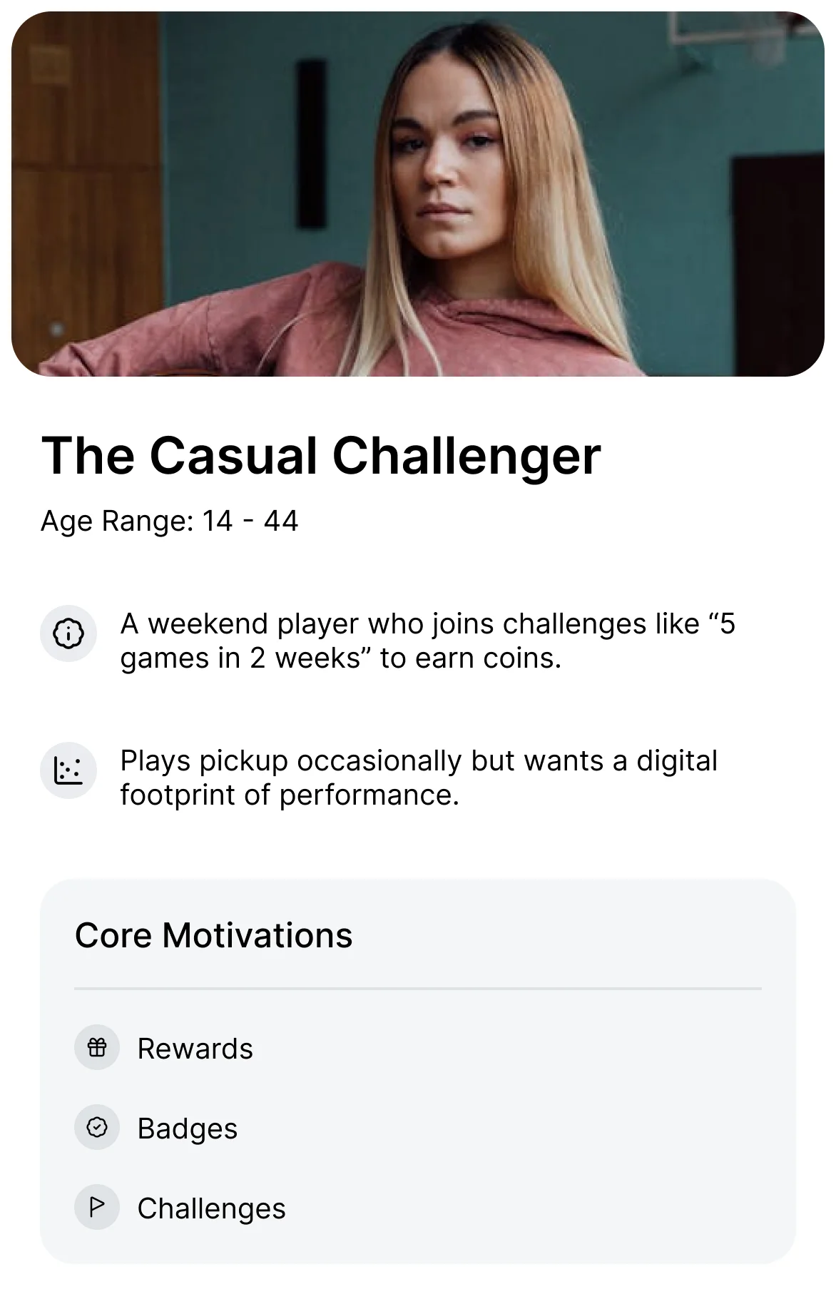
While heavily male-dominated, we designed with an inclusive tone. Basketball is global, and inclusivity strengthens community adoption.
Before shaping flows, I benchmarked direct competitors. A few stood out:
Hooper.gg: The closest direct competitor, structured around gamified stat-tracking and leaderboards. Strong in community-building but visually cluttered and limited in aspirational design.
HomeCourt: Set the standard for mobile-first basketball AI experiences. Their onboarding feels premium, though the UI can overwhelm casual users with dense stats.
SportsVisio: Positioned toward semi-pro and pro players. Their product lacked a lifestyle layer, skewing too technical for casual athletes.
I also drew lessons from indirect competitors:
Strava: Seamless blend of competition and social connection.
Duolingo: Mastery streaks and micro-feedback systems.
TikTok: Ease of video sharing and instant gratification in UX.
Each competitor provided inspiration but also gaps: clutter, intimidating UI, or lack of lifestyle culture. These gaps shaped our north star — a modern, clean, glassmorphic UI with just the right balance of performance and play.
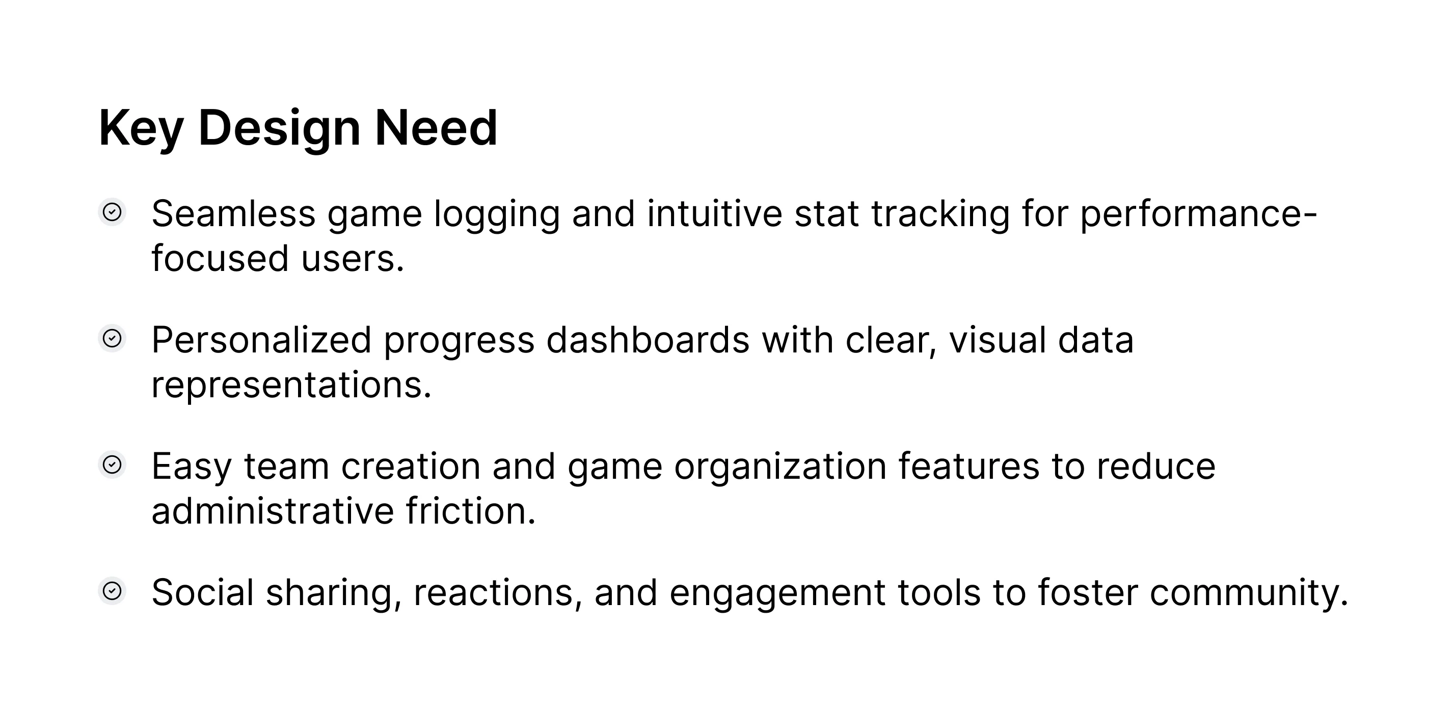
From synthesis, we articulated three core design problems:
How do we make basketball data approachable and fun, not intimidating?
How do we build a system that celebrates community while rewarding individual achievement?
How do we maintain aesthetic clarity in a data-heavy UI?
Answering these became the foundation for design decisions ahead.
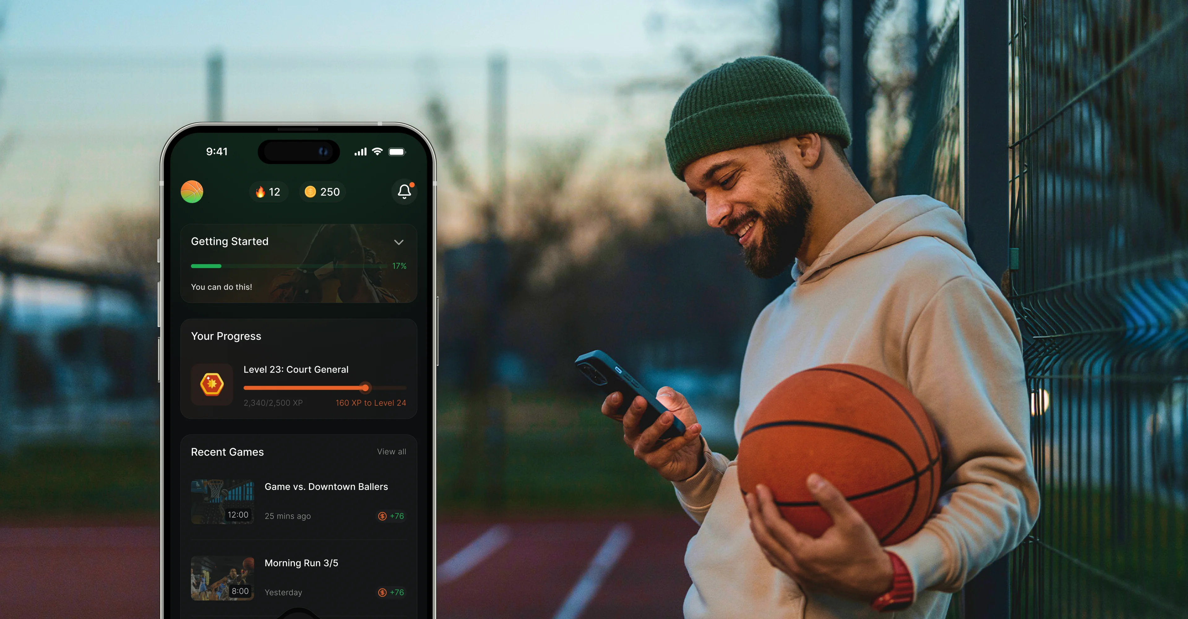
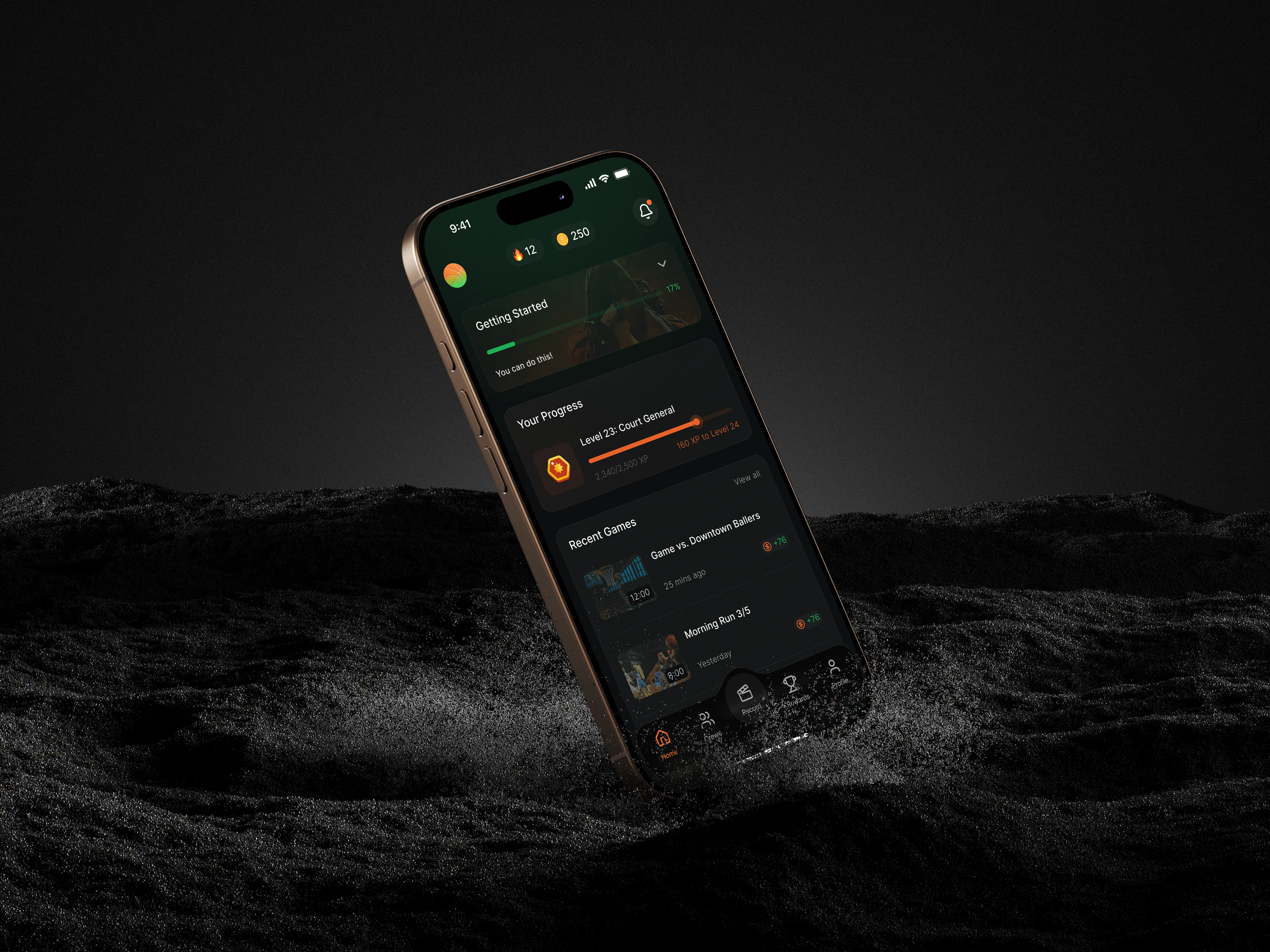
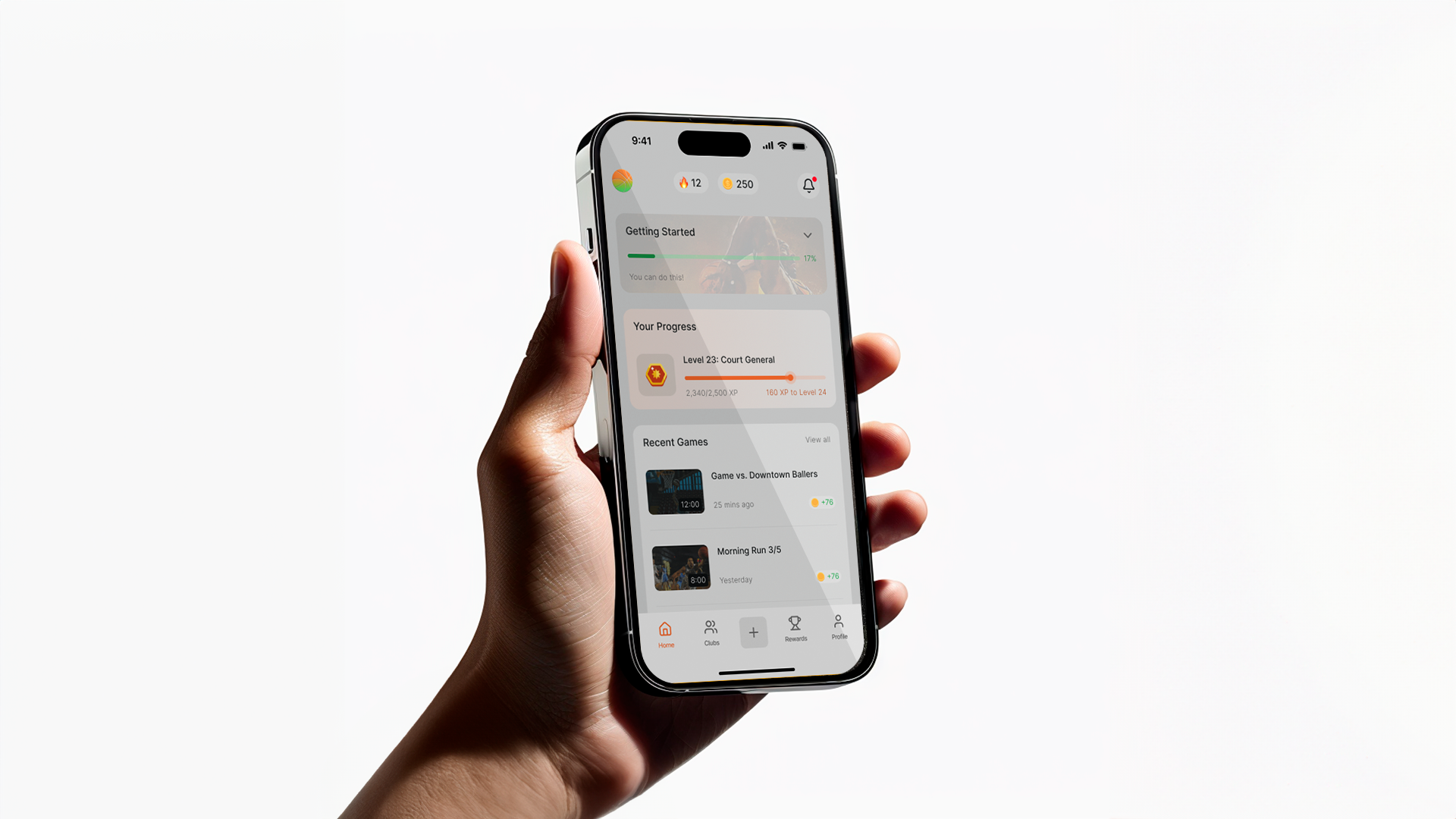
Clarity: Use minimal and modern glassmorphic UI to avoid data overload.
Gamification: Layer streaks, rewards, and challenges without overwhelming.
Social Energy: Emphasize crews, activity feeds, and highlights for shareability.
Future-Readiness: Ensure screens are developer-ready, scalable, and adaptable to AI video processing flows.
When designing Ball Club, I knew the ecosystem was already filled with apps promising performance tracking and competitive play. My task was not to copy them but to understand their value and spot gaps that would define our unique space.
Hooper.gg
Strengths: Strong community-driven leaderboard, simple player profiles, and gamified achievements.
Weaknesses: Overly cluttered stats pages. Their interface feels built for hardcore players, leaving casual hoopers intimidated.
HomeCourt (by Nex Team)
Strengths: Polished onboarding, refined computer vision for shooting drills, clear video highlights.
Weaknesses: Heavy emphasis on training drills, less on the social, crew-based, gamified experience that today’s players want.
SportsVisio
Strengths: AI-powered video breakdown, auto-clipping highlights, market push toward analytics.
Weaknesses: Feels more like a coaching tool than a fun-first, social product.
Hudl and Pixellot: Great for organized teams, but inaccessible for pickup and casual players.
PickupHub: Helps players organize games, but offers no game recording or gamification layer.
Most competitors either go too deep into analytics (alienating casual users) or too shallow into community (failing to sustain long-term engagement). The white space lies in merging fun-first culture with pro-level AI insights.
That became Ball Club’s north star.
Basketball is as much about bragging rights and clips as it is about stats. So the design needed to feel lightweight and hype-driven, even when surfacing deep analytics.
Our target audience (14–44, TikTok and Instagram natives) cares about shareability and community. Crews, streaks, leaderboards, and clips had to be as prominent as individual stats.
We built the app’s engagement model inspired by Duolingo’s streaks and leveling system. Progression, badges, and coins turn pickup ball into an RPG-like journey.
Glassmorphism + Energy: Inspired by Suno’s frosted glass aesthetic, with vibrant orange and green accents to capture energy and motion.
Typography: Bold sans-serif with clear hierarchy to balance data-heavy screens.
Minimalism: Avoid clutter with airy layouts and modular cards.
Some stakeholders pushed for denser stat breakdowns. My stance as lead designer was to prioritize digestibility over data overload. We compromised with collapsible stat modules, ensuring hardcore players could go deep while casual users weren’t overwhelmed.
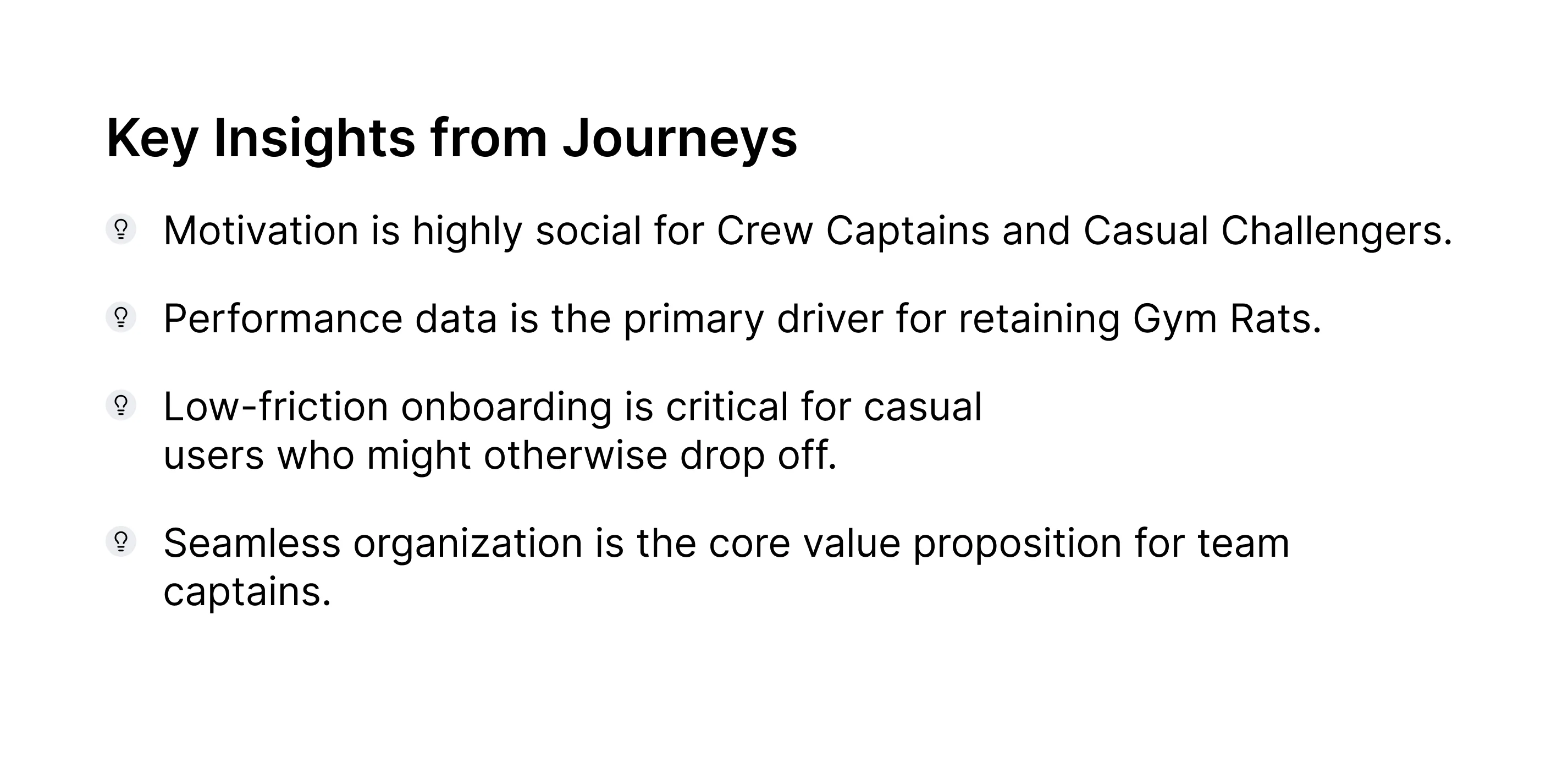
Through competitor analysis, user profiling, and assumed behavioral insights, I developed three guiding personas. These personas grounded design choices and helped us evaluate features through a human lens.
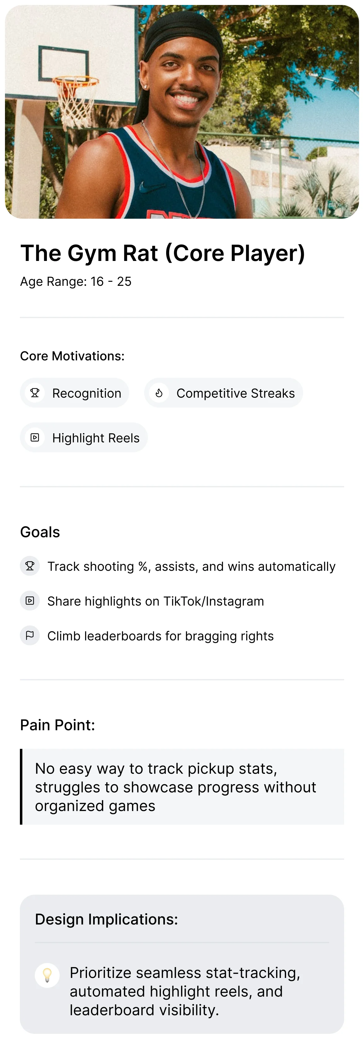
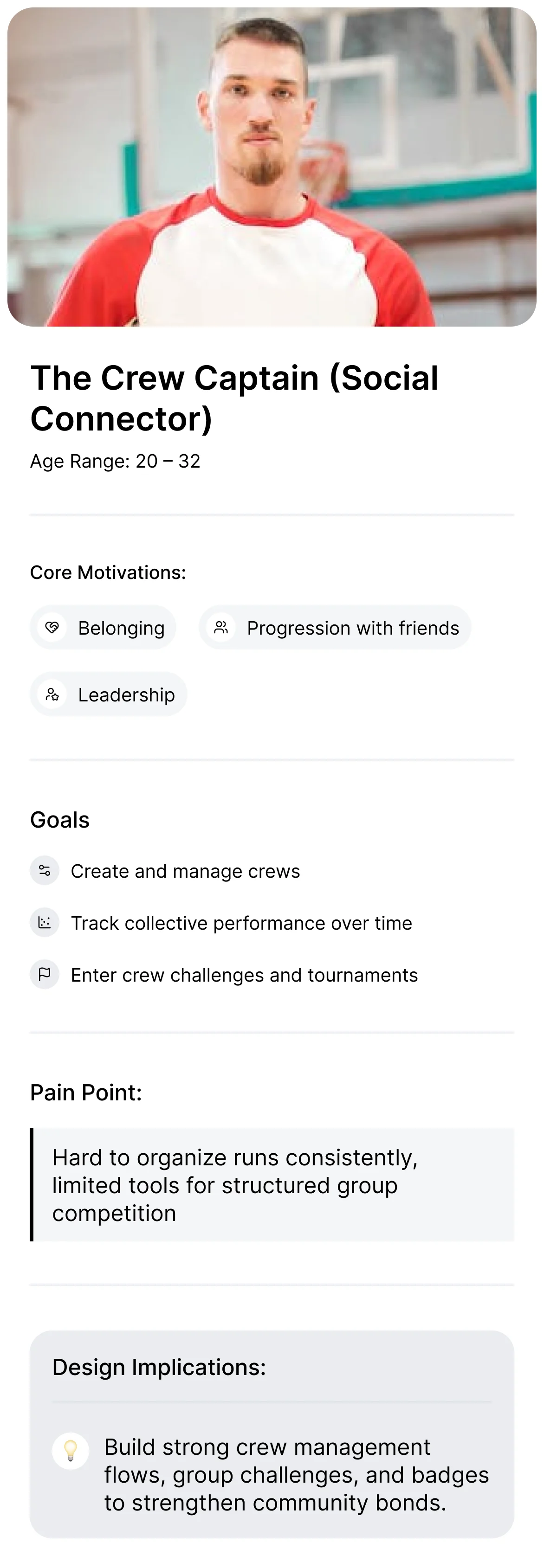
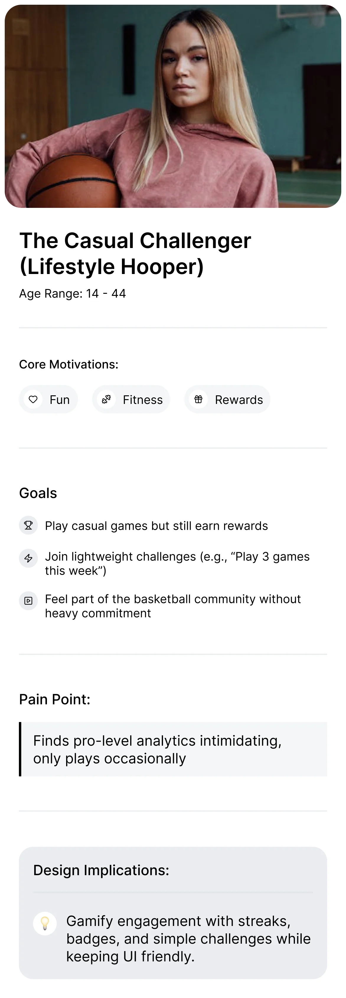
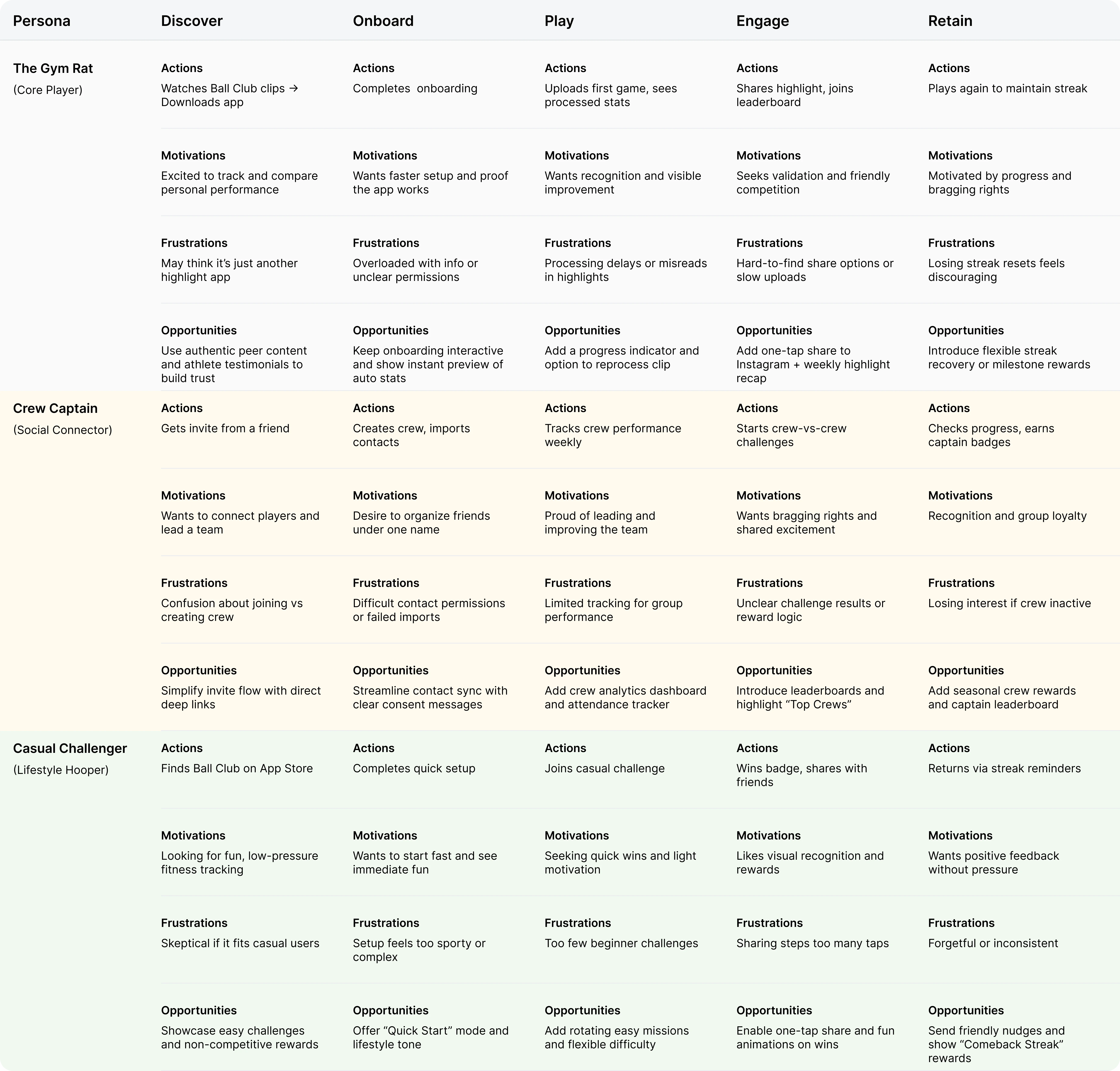
We mapped journeys for each persona to visualize motivations, frustrations, and opportunities across the app lifecycle.
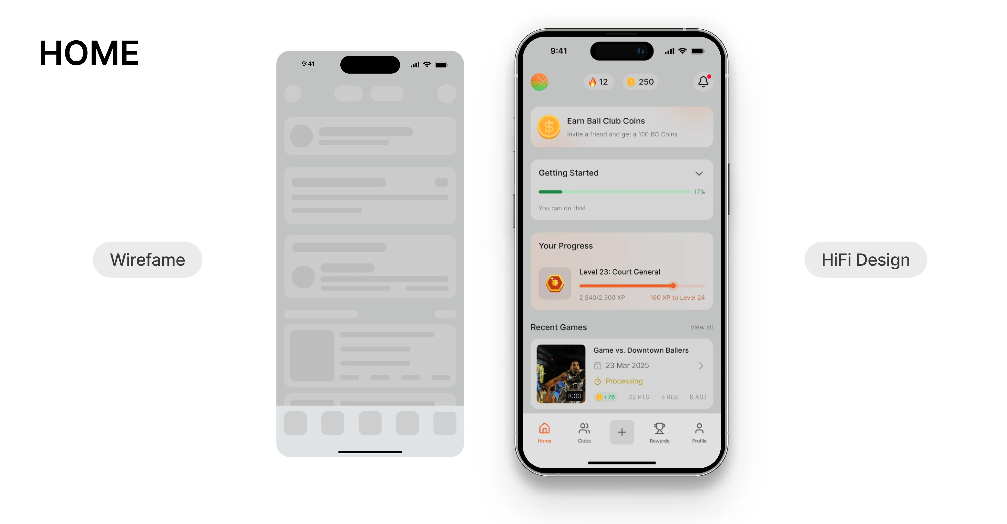
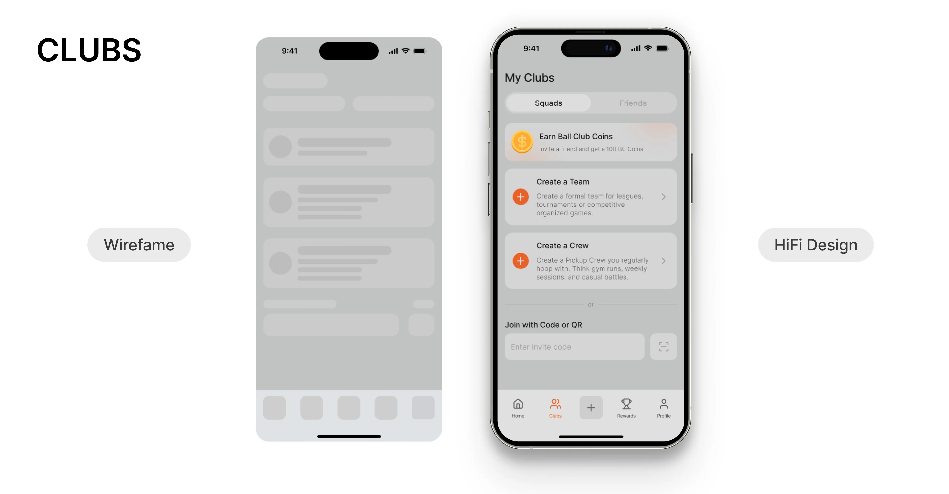
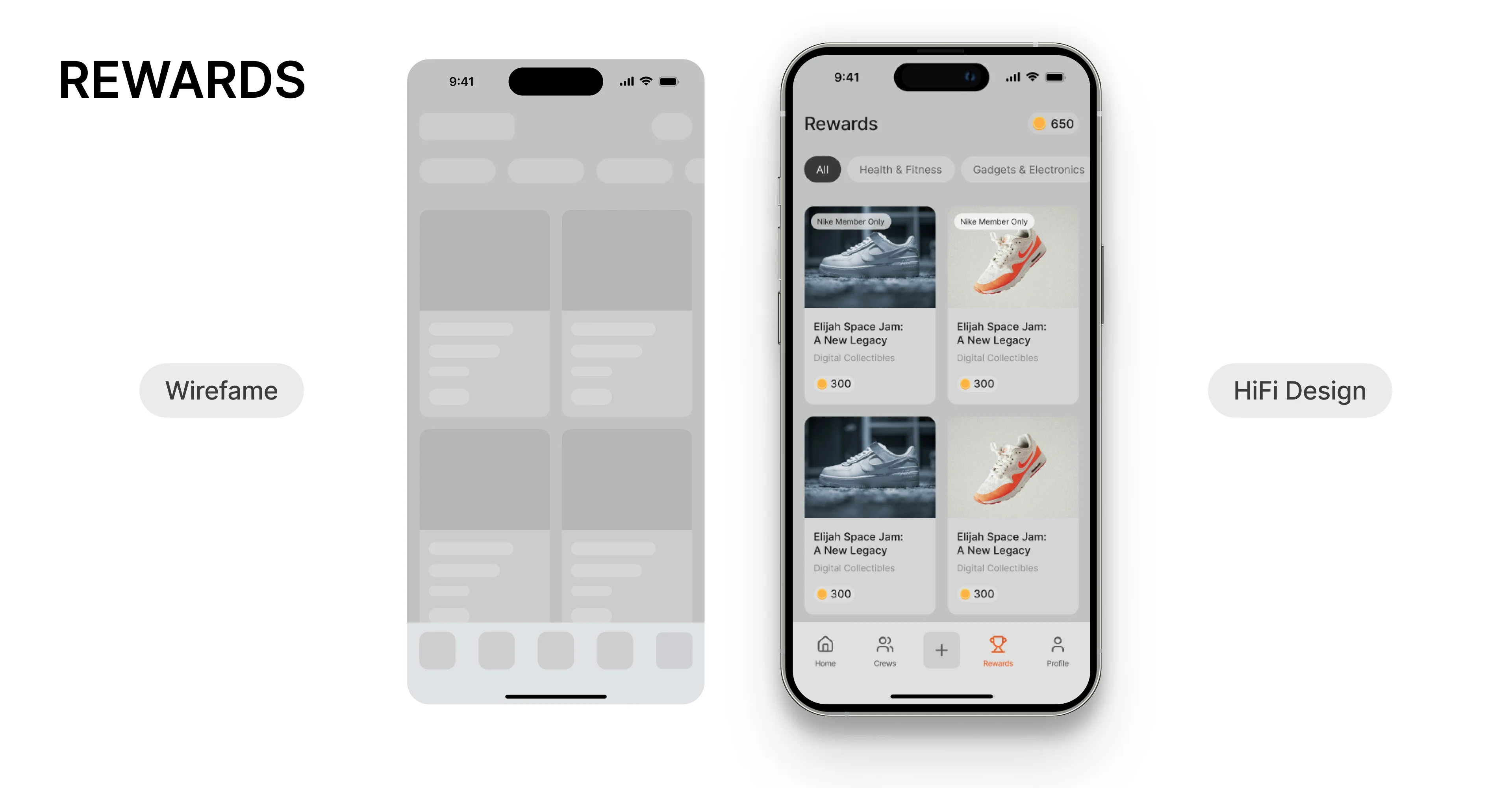
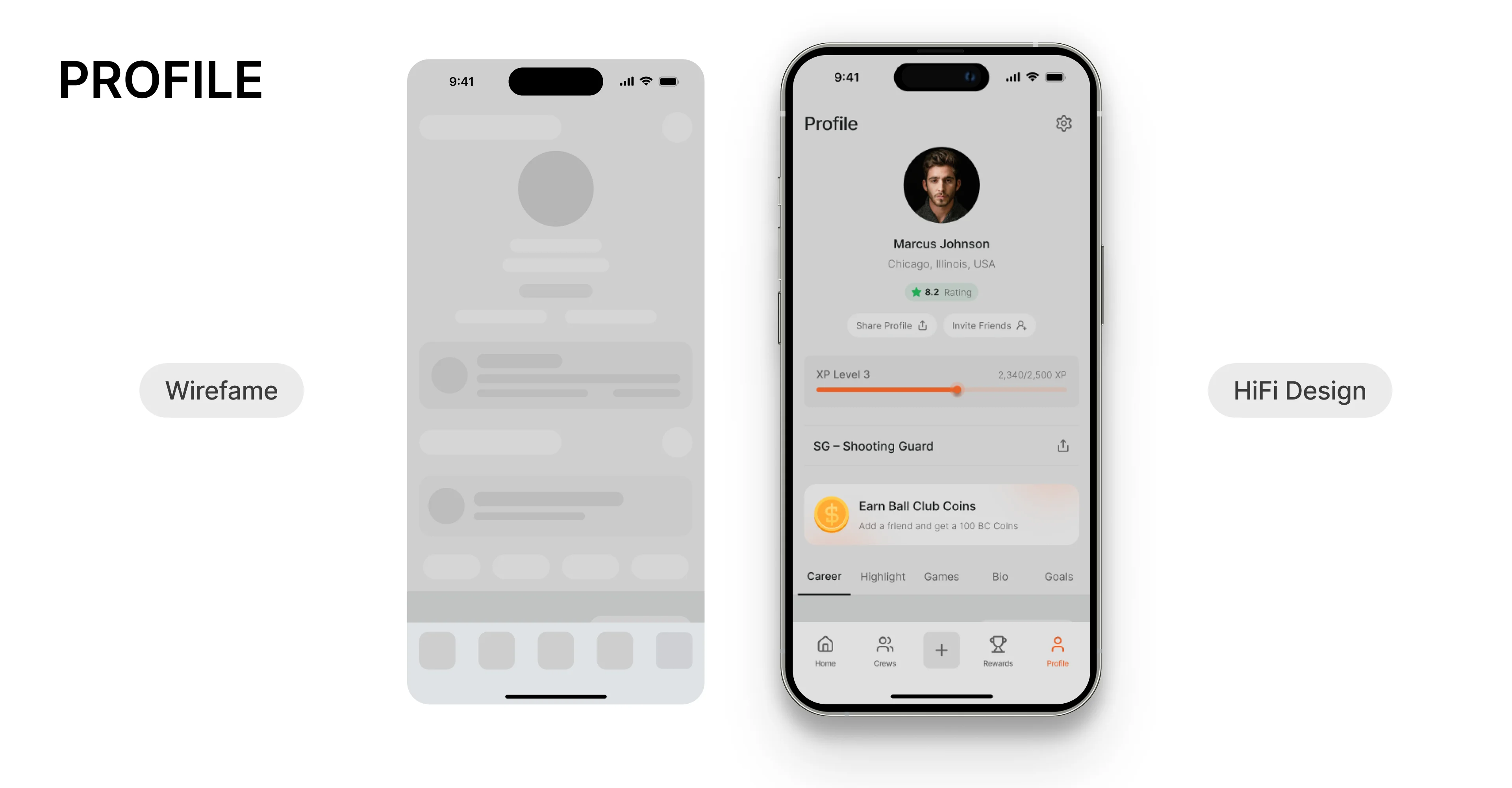
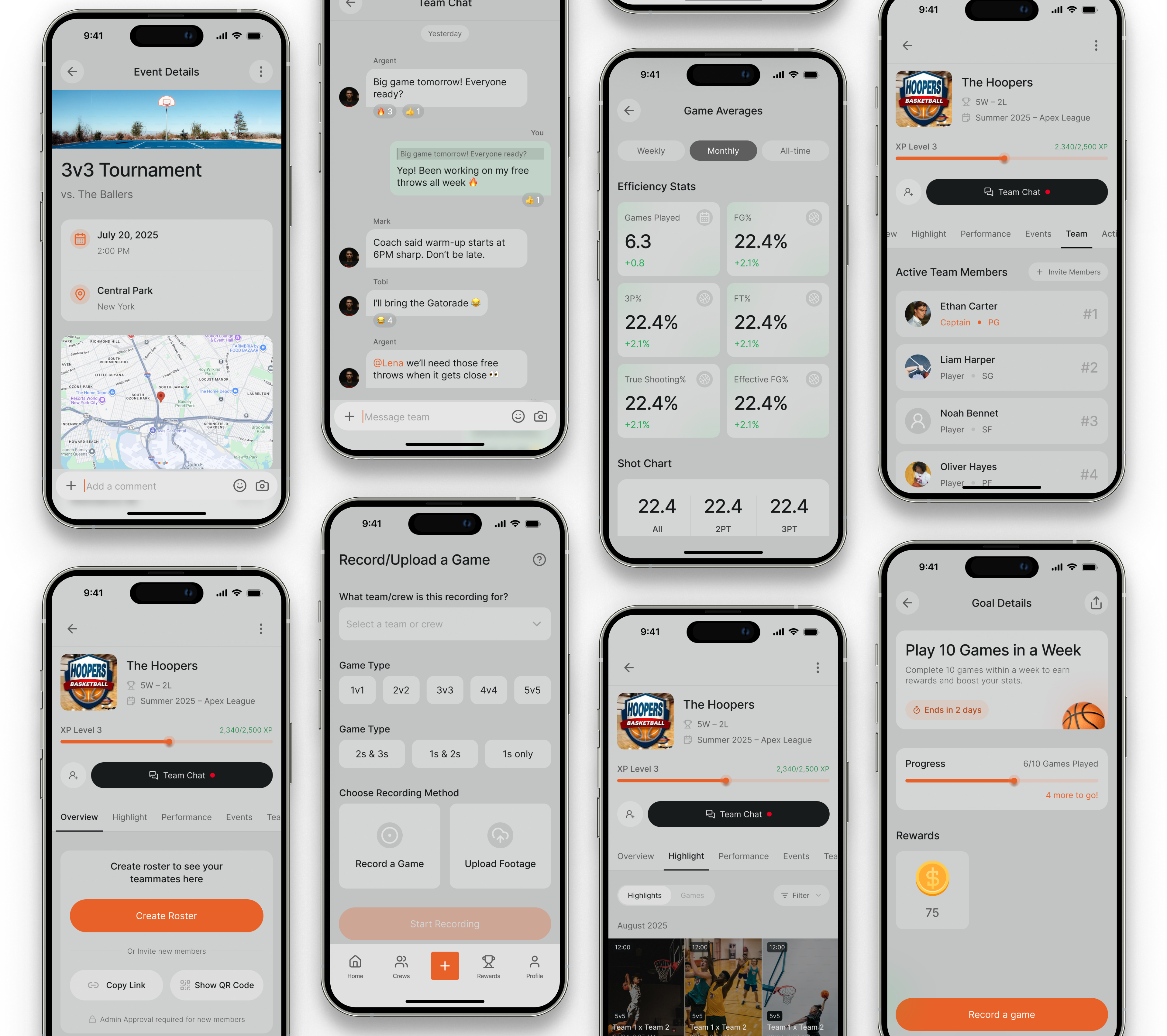
This stage was about moving from research and opportunity framing into tangible design structures. I started with low-fidelity sketches, then evolved them into wireframes that shaped the core flows of the Ball Club experience. Afterwards, I transformed the structured wireframes into a visually compelling, branded product experience. By layering typography, color, and microinteractions on top of the flows, the Ball Club app moved from sketches into something users could immediately connect with.
Although the product has not launched yet, the design process achieved several internal outcomes that validated its direction:
Clarity in the user journey: Wireframes and flows helped stakeholders see how onboarding, crews, challenges, and stats tied together cohesively.
Visual alignment: Hi-fi screens created a shared language between design, product, and engineering, making development specifications clearer.
Stakeholder buy-in: By framing hi-fi mockups alongside wireframes, stakeholders could visualize the impact of design choices and agree on the most critical features for launch.
Problem: Confusing onboarding
Solution: Progressive disclosure and simplified steps reduced friction for first-time users.
Problem: Overcomplicated crew setup
Solution: Two clear pathways (start a crew or join with code) gave users instant clarity.
Problem: Low visibility of challenges
Solution: A dedicated challenge hub with engaging visuals put challenges at the heart of the app.
Problem: Intimidating stats
Solution: Reframed stats with progress bars, streaks, and celebratory visuals that motivated rather than overwhelmed.
Not every design recommendation made it into the first release:
Personalization: I recommended deeper avatar and theme customization at launch, but stakeholders prioritized crew branding first.
Gamification depth: Some advanced reward systems (like tiered badges) were deferred to post-launch to keep the MVP lean.
Data insights: I proposed richer filtering for stats, but stakeholders preferred to release a simplified version for speed.
These compromises taught me to balance user-centered vision with stakeholder realities, ensuring forward momentum without losing sight of long-term goals.
Early structure pays off: Starting with flows and wireframes gave stakeholders clarity and reduced late-stage design conflicts.
Narrative framing matters: Positioning features as part of a “journey” (onboarding → crews → challenges → stats) helped stakeholders and future users understand the app’s story.
Design as negotiation: A UX designer’s role isn’t only about visual craft — it’s about guiding stakeholders toward user-friendly choices while adapting to business constraints.
Future opportunities: Post-launch, I would recommend testing challenge engagement, crew formation rates, and user retention to inform the next iteration.